
#30DayMapChallenge: 10 Minute Map
When the clock starts ticking, creativity takes over. Discover how cartographers created stunning visualisations in just ten minutes for Day 13 of the challenge.

The clock was ticking, but creativity was flourishing. For Day 13, cartographers had just ten minutes to create a complete map, proving that powerful visualisations don't always require hours of work. Here are the top 5 entries that made every second count.
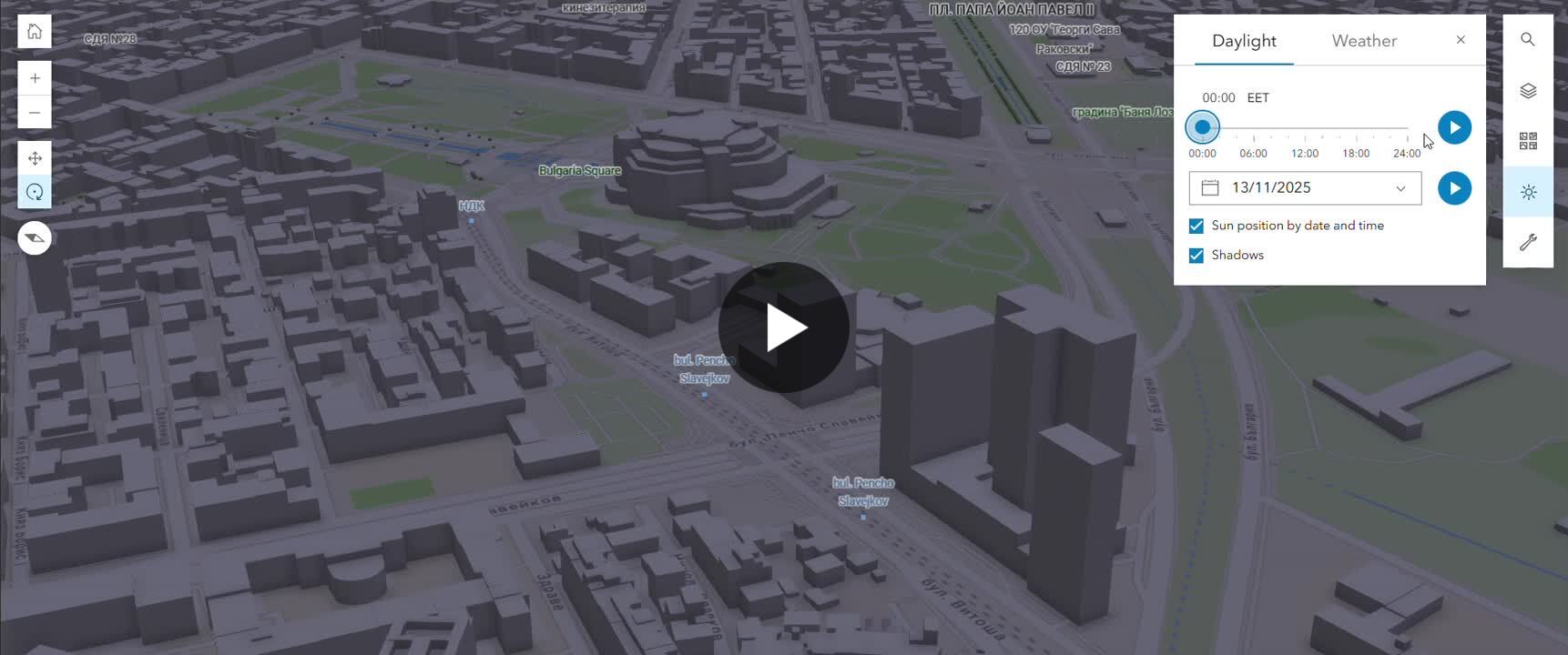
5. Tsvetomir Angelov – Daylight Simulation
Angelov demonstrated the power of accessible tools by creating a stunning daylight movement simulation in ArcGIS Online's Scene Viewer in under five minutes. The result shows how light and shadows transform a cityscape in real-time, proving complex simulations can be both quick and impactful.
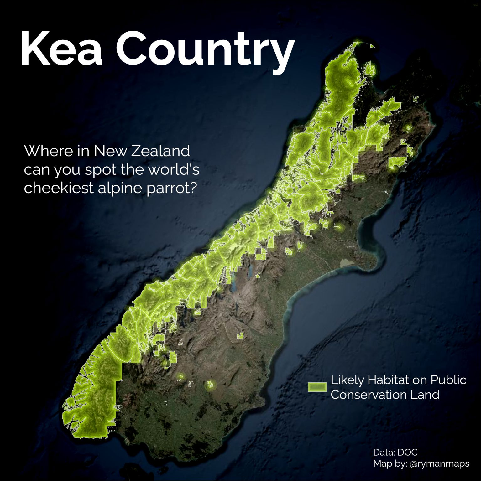
4. Ginevra R. – Kea Bird Range
Ginevra used John Nelson's firefly cartography style to create an elegant species range map of New Zealand's clever Kea parrot in record time. The simple green glow against a dark basemap creates a striking visualisation that perfectly captures the essence of rapid, effective mapping.
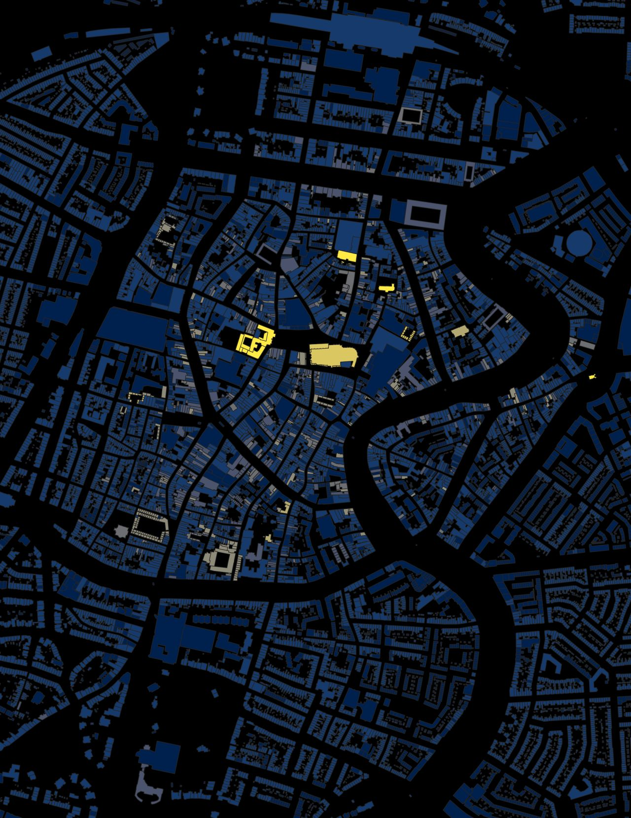
3. Jason Yergeau – Haarlem Building Ages
Yergeau turned to familiar data and tools to map building ages in Haarlem, Netherlands. The result reveals the city's historical growth patterns radiating from the 15th-century St. Bavokerk church, demonstrating how constraint can lead to clarity in urban analysis.
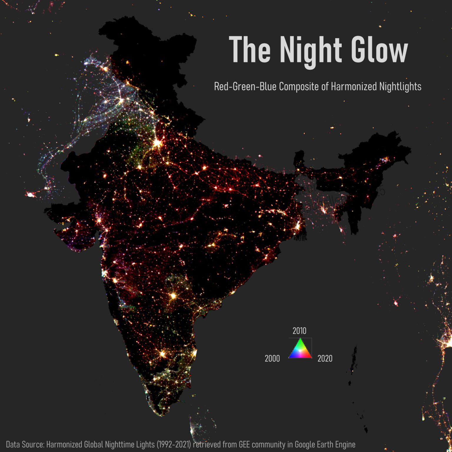
2. Jyoti Singh – India Night Lights
Singh tackled geographic misinformation by recreating the famous "Diwali lights" map of India using actual nighttime lights data. Her work serves as both a beautiful visualisation and an important lesson in data literacy, showing how open data can quickly verify or debunk viral claims.
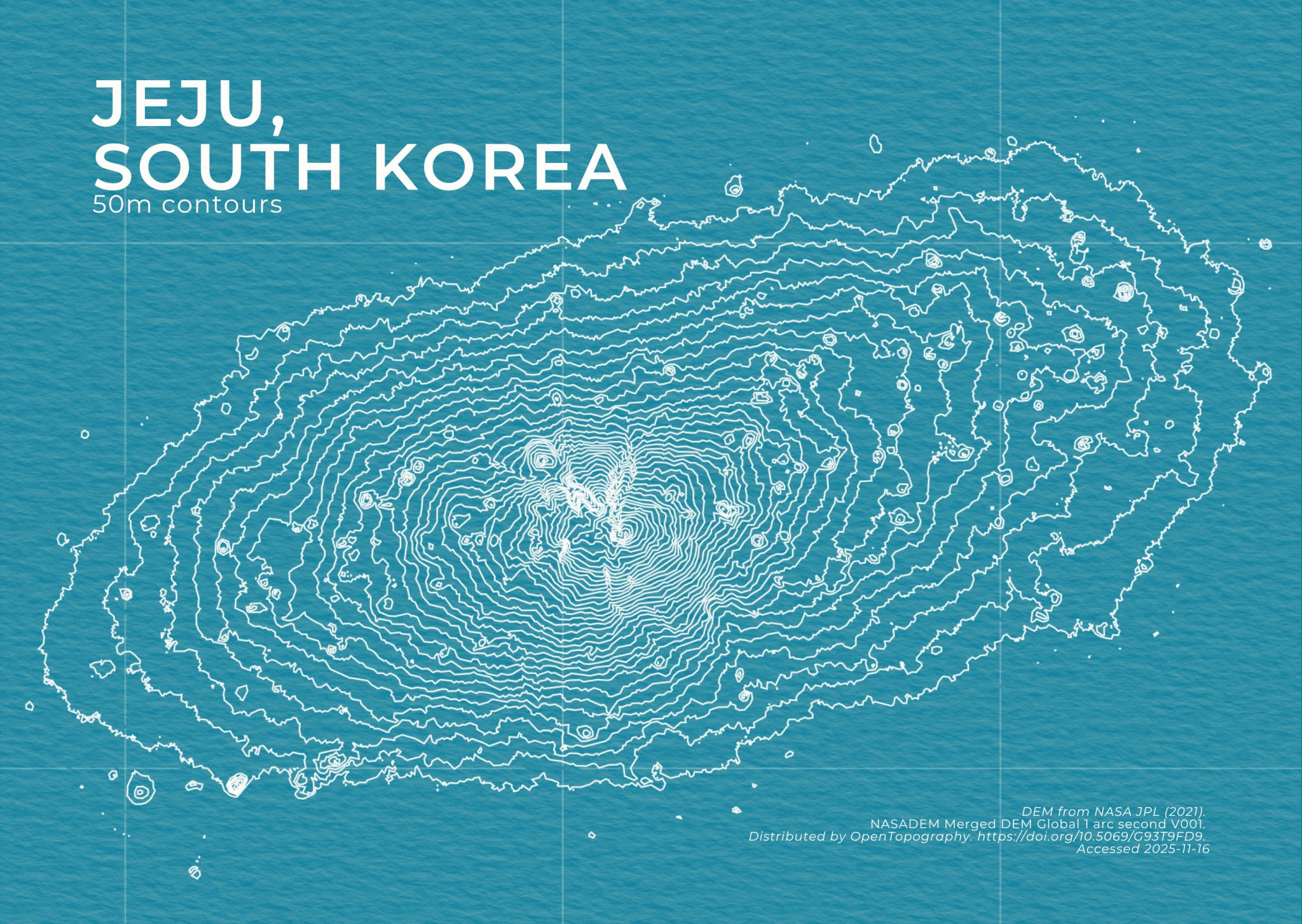
1. Charmyne – Topographic Postcards
My top pick combined technical efficiency with stunning design. Charmyne created a series of topographic postcards featuring islands like Jeju and Sicily, using contour lines to capture their unique landscapes. The elegant simplicity proves that sometimes the most beautiful maps are also the most straightforward to create.
These maps demonstrate that time constraints can spark incredible creativity and efficiency, pushing cartographers to focus on what truly matters in their visual storytelling.


Comments ()