
#30DayMapChallenge: Air
From the silent journey of a migrating bird to the violent path of a typhoon, these maps give shape to the invisible forces moving through the air around us.

For Day 10 of the #30DayMapChallenge, cartographers faced perhaps their most elusive subject yet: air itself. The results were not mere weather maps, but sophisticated visual narratives that made the invisible medium around us suddenly, strikingly visible.
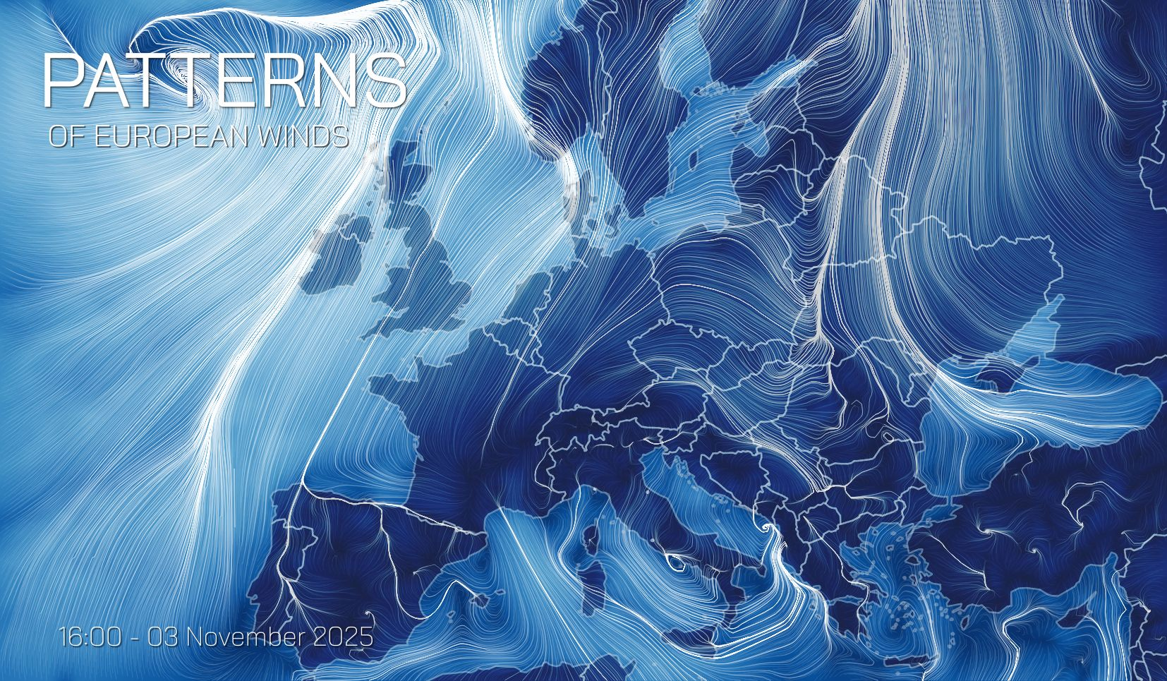
5. Maayke Leenstra – European Wind Patterns
Maayke Leenstra transformed numerical wind data from Copernicus ECMWF into a lyrical animation of European air currents. Each flowing line traces the path of air 10 meters above the ground, revealing the continent's breath in early November 2025. The piece serves as a moving homage to Fernanda Viégas and Martin Wattenberg's iconic Wind Map.
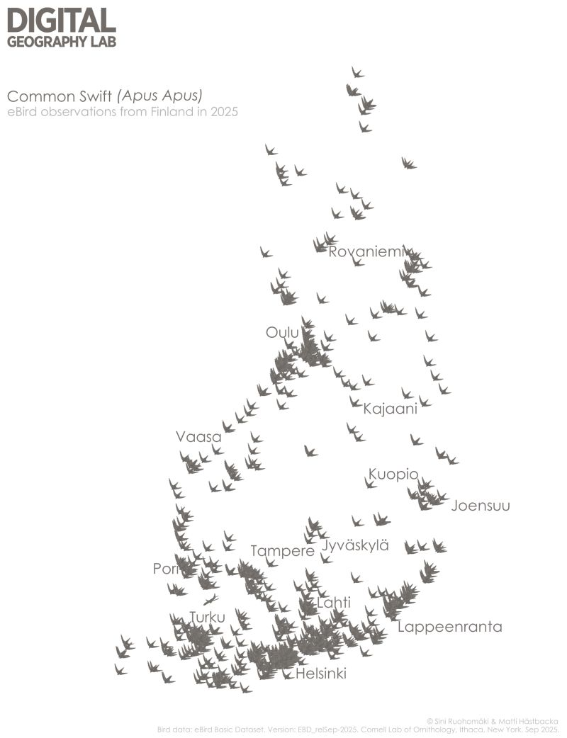
4. Digital Geography Lab – Swift Sightings in Finland
The Digital Geography Lab mapped the Common Swift, a remarkable bird that spends most of its life airborne, even sleeping and eating while flying. The endangered species' sightings across Finland are contrasted with the significant carbon footprint of human air travel, highlighting the stark environmental impact of our mobility compared to nature's efficient flyers.
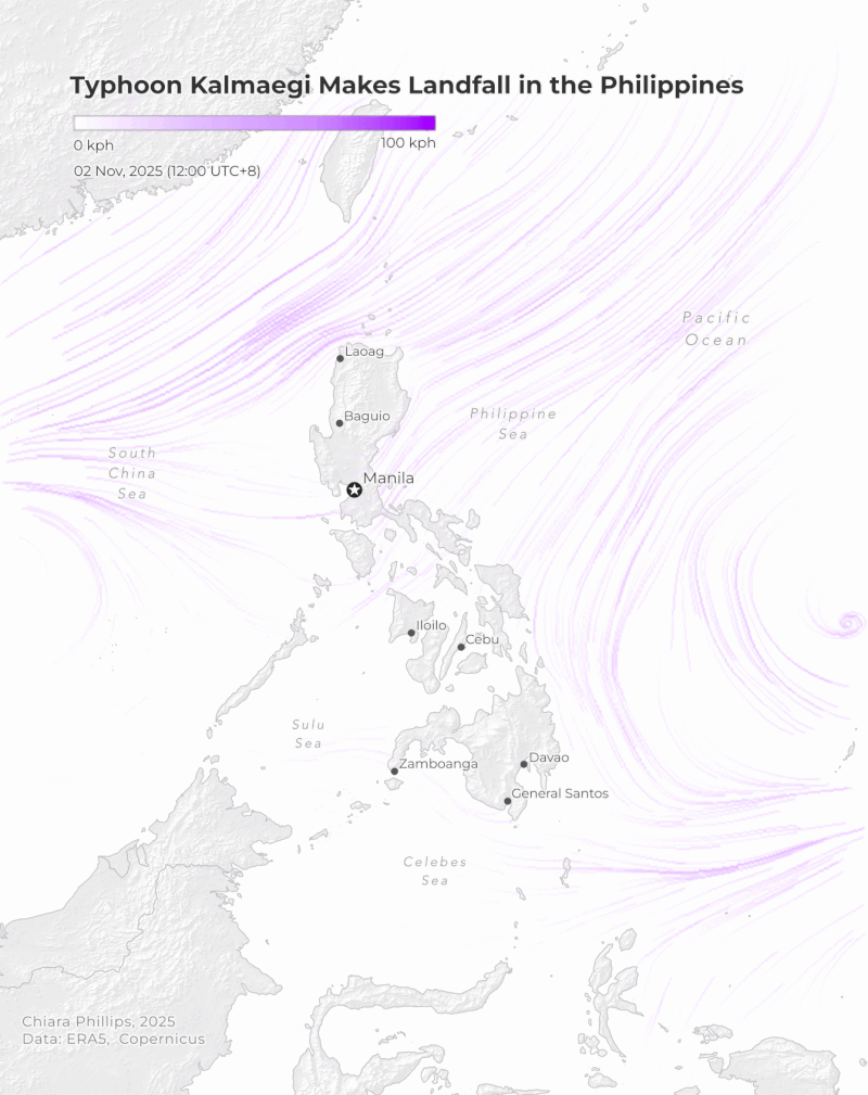
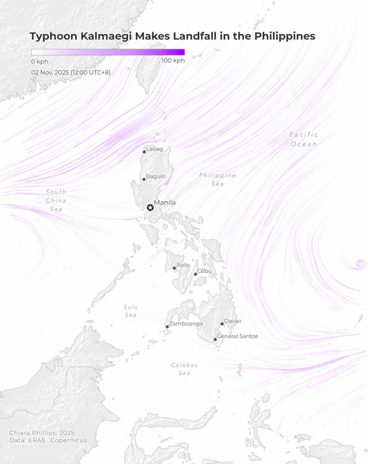
3. Chiara Phillips – Typhoon Landfalls
Chiara Phillips documented air at its most destructive, mapping the consecutive paths of Typhoon Kalmaeqi and Super Typhoon Fung-wong as they moved from the Philippines to Vietnam. Her work included a crucial public service: clarifying that "landfall" marks the moment a storm's centre moves from water to land, bringing the full force of its winds and rain.
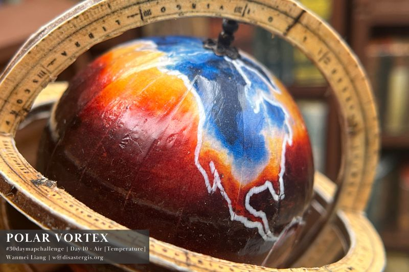
2. Wanmei Liang – Surface Air Temperatures
Wanmei Liang continued her series of miniature globes with a striking visualisation of surface air temperatures during a December 2022 cold front. The piece captures the dramatic sweep of frigid air across the United States, transforming complex atmospheric data into an object one could almost hold in hand.
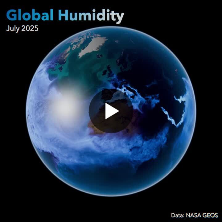
1. Peter Atwood – Global Humidity Patterns
Peter Atwood's visualisation of July 2025's global humidity patterns stood out for its elegant simplicity. Using NASA GEOS data, he created a world map where subtle colour variations tell a profound story about the moisture content of our atmosphere. A quiet masterpiece in a field often crowded with visual noise.
Together, these maps demonstrate that air is not empty space, but a dynamic, measurable, and beautifully complex medium that shapes everything from global climate to individual journeys, birds, or violent storms.


Comments ()