
#30DayMapChallenge: Map from 2125
From drowned coastlines to interplanetary transit, these maps are less about predicting the future and more about using it as a canvas to explore the outer limits of cartographic imagination.

The year is 2125. Humanity has expanded beyond Earth, coastlines have shifted, and digital realms have transformed how we navigate space. For Day 12 of the #30DayMapChallenge, cartographers became time travellers, projecting our world a century into the future. These are the most compelling visions of what awaits.
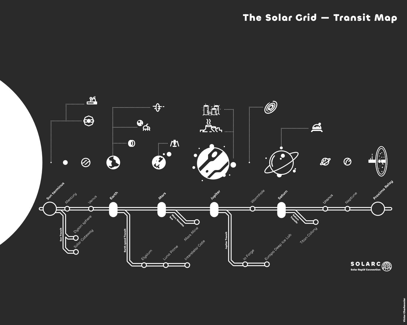
5. Victor Charbonnier – The Solar System Transit Map
Charbonnier re imagines interplanetary travel as a subway system, creating a sleek metro-style map connecting planets across our solar system. This clever vision transforms cosmic distances into commuter routes, suggesting a future where space travel becomes as routine as taking the morning train.
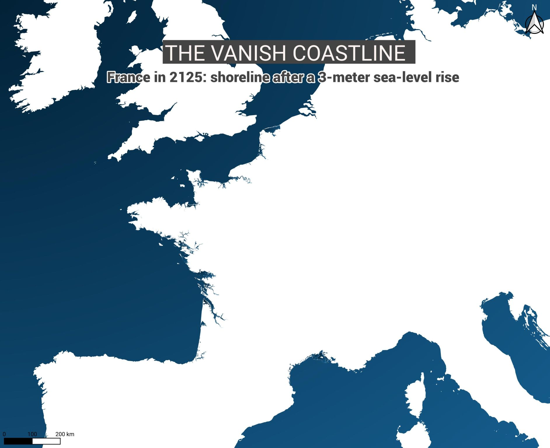
4. Helene Dupriez – France's Vanishing Coast
Using IPCC and NASA projections, Dupriez shows France after a +3 meter sea-level rise—a scientifically-grounded vision of drowned coastlines, reshaped estuaries, and new islands emerging where cities once stood. The ghostly white imprint of lost land serves as both warning and beautiful cartographic memorial.
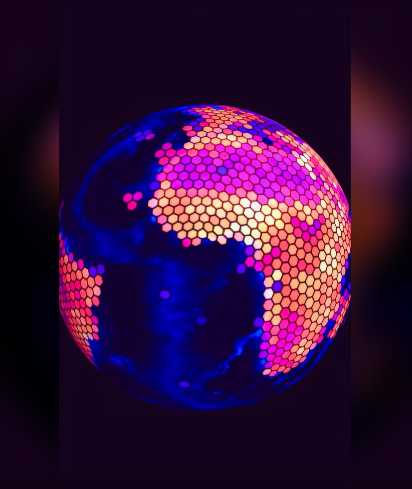
3. Milan Janosov – Global Population Shift
Janosov creates a data-driven projection of 2125 population density using 50 years of historical data and H3 hexagons. His linear regression model, visualised through stunning TouchDesigner animation, shows how spatial data science can create cinematic, yet scientifically-informed, visions of our planetary future.
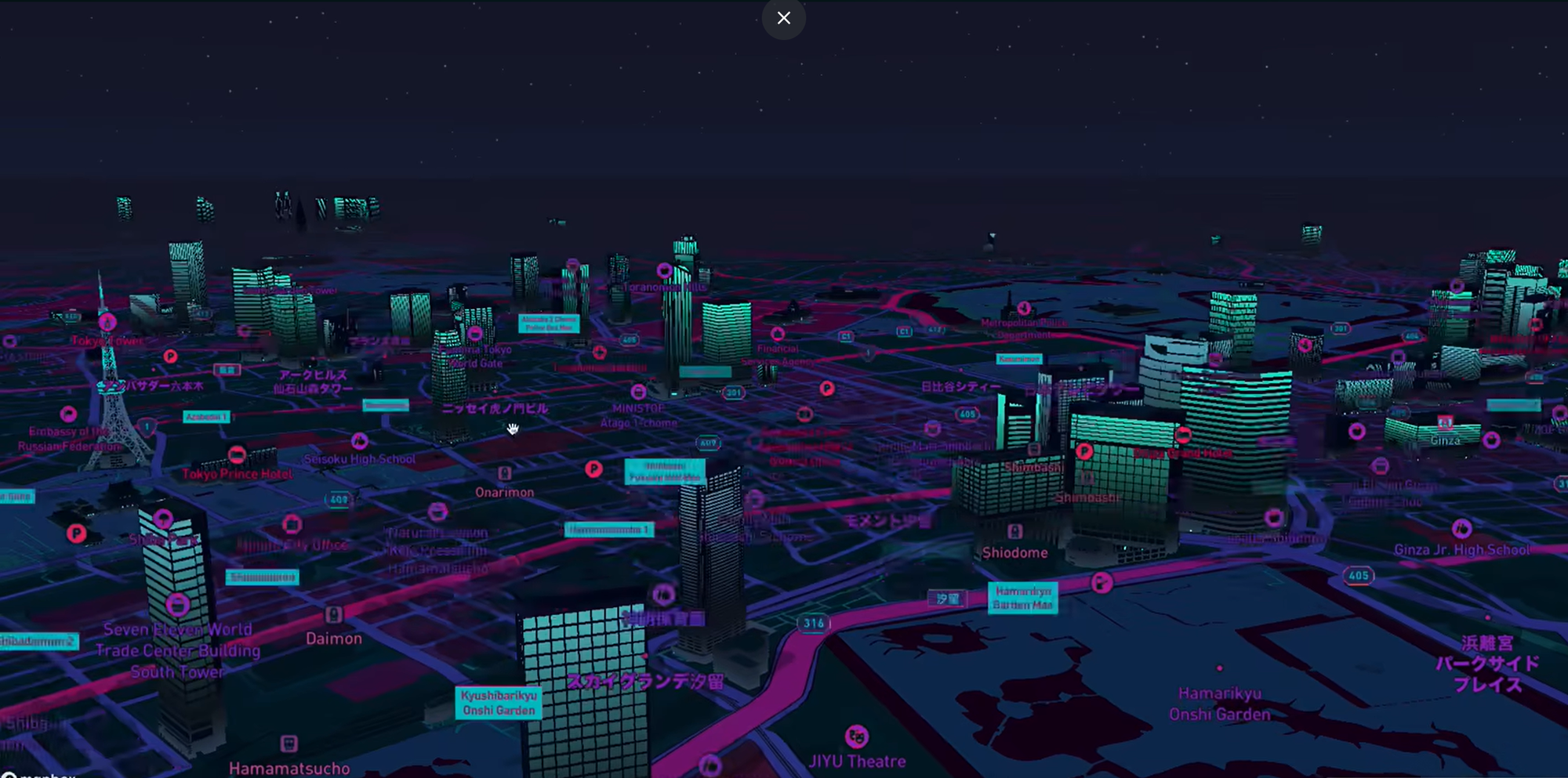
2. Kyle Walker – Tokyo Cyberpunk
Walker immerses us in a neon-drenched 2125 Tokyo, rendered in stunning 3D with Mapbox. This cyberpunk vision showcases new technical capabilities through a custom palette_to_lut() function that allows complete stylistic control, pointing toward a future where cartographic personalisation knows no bounds.
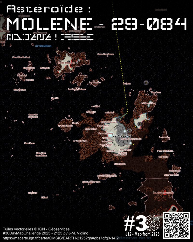
1. Jean-Marc Viglino – Galactic Empire France
Viglino boldly re imagines France as a Star Wars-style galactic territory, complete with Imperial aesthetics and futuristic iconography. Using IGN's vector tiles with custom styling, he creates a vision where French geography meets Star Wars universe-building—complete with a multimedia presentation featuring AI-generated visuals and an epic soundtrack.
Two maps deserve a special shout-out for their brilliantly creative approach to the theme:
Alejandro Quinto Ferrández – The Gameful Interface
A visionary prototype for how we might interact with maps in 2125. Drawing from sci-fi and philosophy, Alejandro envisions a future where map interfaces are immersive, game-like experiences, transforming the user from a passive viewer into an active player.
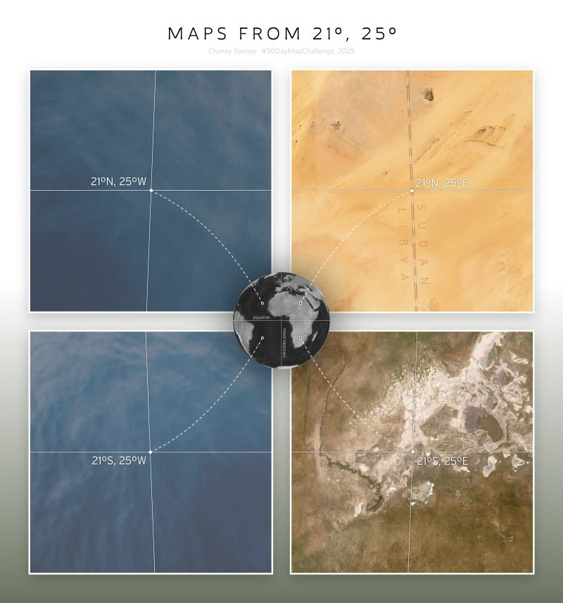
Chaney Swiney – The Coordinate Explorer
In a brilliantly clever twist, Chaney interpreted "2125" not as a year but as coordinates—21° and 25° in all four cardinal combinations. The result is a fascinating comparative study of landscapes across our present-day planet, reminding us that the future is built upon the fascinating geography of today.
These maps are more than artistic exercises, they're portals to possible futures, challenging us to consider how today's technological and environmental decisions will reshape our world a century from now.


Comments ()