
#30DayMapChallenge: Minimal
When cartographers erase everything but the essential, a single line can become a country, a dot can represent millions, and a square can stand for a continent.
Day 11 theme proved that sometimes less truly is more. Cartographers embraced restraint, stripping maps down to their essential elements with stunning results. Here are my top 5 picks counting down to number one:
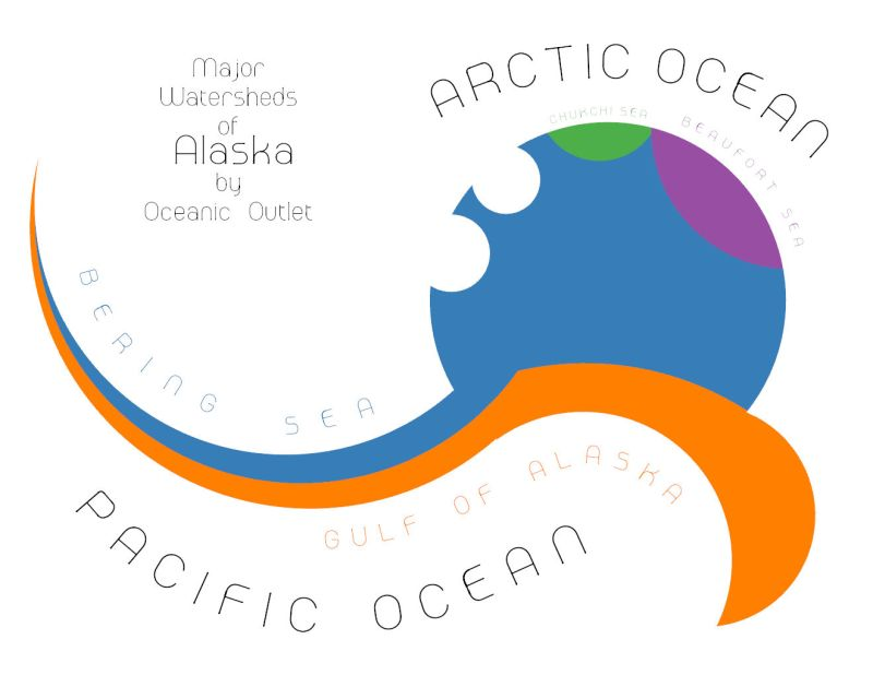
5. Britta Schroeder – Alaska Watersheds
A masterclass in typographic cartography where text becomes topography. Major watersheds flow into their oceanic outlets through carefully arranged lettering, proving that labels can be the map itself.
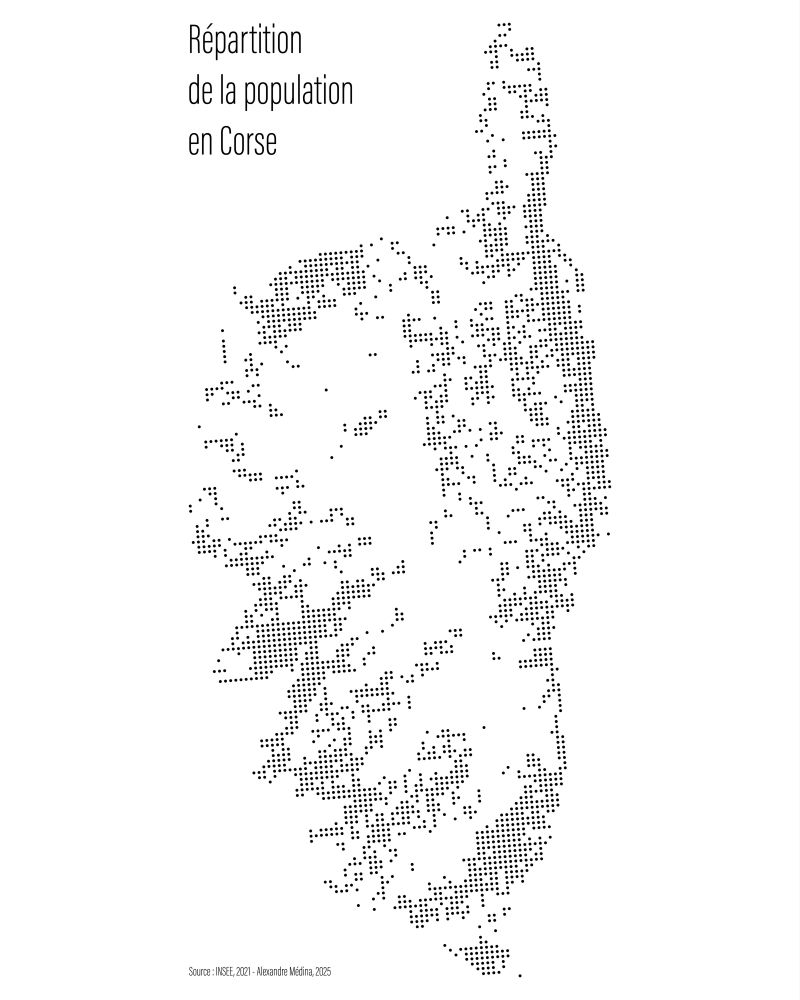
4. Alexandre Médina – Corsican Population
A single-hue visualisation of population distribution across Corsica, where density variations create a subtle portrait of human settlement patterns against the island's distinctive silhouette.
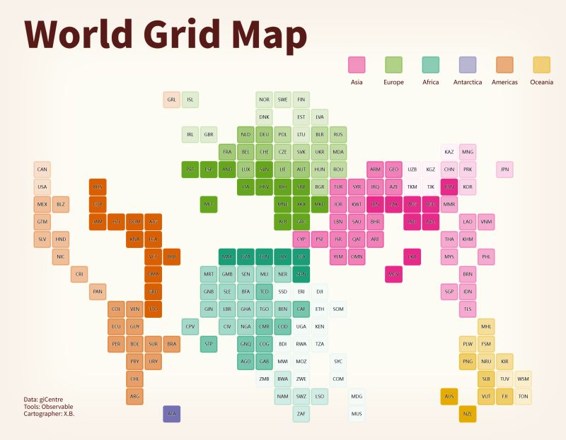
3. Biao Xiong – World Grid Map
A beautifully abstracted world where each country becomes a coloured square organised by continent. This geometric reduction transforms complex geography into a clean, systematic visualisation that reveals global patterns at a glance.
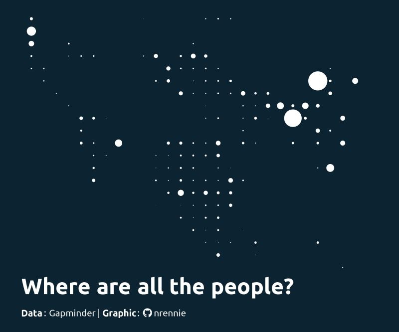
2. Nicola Rennie – World Population
A stark, powerful dot map of global population where each point represents millions of people. The sparse arrangement highlights both crowded regions and empty spaces with elegant simplicity.
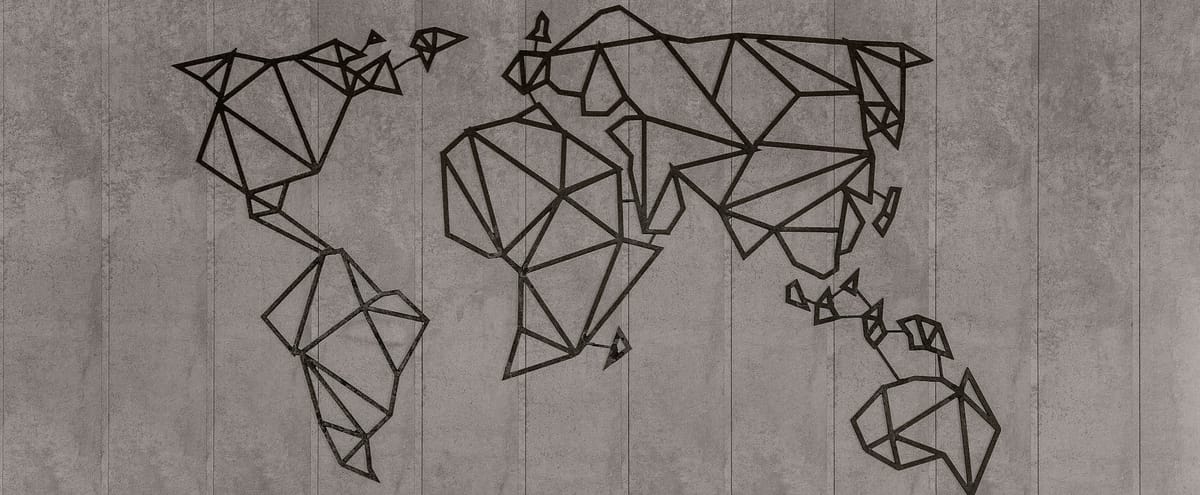
1. Alejandro Quinto Ferrández – Country Hangman
My top pick for its brilliant reinvention of what a map can be. Turning iconic country boundaries into an interactive guessing game transforms minimalism into pure playfulness, proving that sometimes the most engaging maps are the ones that leave everything to the imagination.

These maps demonstrate that by removing the non-essential, cartographers can reveal deeper truths about place, space, and our relationship with geography.


Comments ()