
#30DayMapChallenge: Points
Day 1: A stunning start

The first day of the map challenge has blown away all expectations! It’s been incredible to see the creativity and diversity of themes emerging from the community. From intricate artistic pieces to powerful data-driven stories, the bar has been set incredibly high.
While it was tough to choose, I’d like to share my top 5 maps from Day 1 that stood out for their originality, technique, or sheer visual impact.
Here is my countdown, from #5 to the top spot:
5. Helene Dupriez – Global Earthquakes
A classic and powerful use of points. Helene used cluster visualisation to map all earthquakes with a magnitude greater than 3 from 2025, effectively highlighting the planet's most seismically active zones. It’s a fantastic example of using a straightforward technique to make complex data instantly understandable.
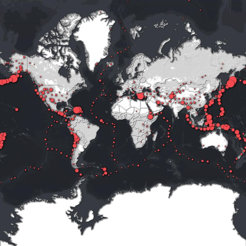
Why it stands out: Clean, scientific, and globally impactful.
4. Helen McKenzie – Airbnbs of Edinburgh
Helen shamelessly embraces the "firefly" cartography style, and it works perfectly. This map is not only visually appealing but also tells a clear story about density and location. It’s a brilliant example of how a specific aesthetic can make a local dataset pop.
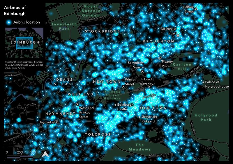
Why it stands out: Instantly recognisable style that perfectly suits the urban subject matter.
3. Ed Cook – Search & Rescue Decision Points
This map proves that cartography can be a critical, life-saving tool. Ed’s map of decision points in the Tararua mountains of New Zealand uses glowing symbology to highlight potential navigational hazards for outdoor enthusiasts. It’s a perfect fusion of beautiful design, practical GIS data, and a powerful, humanitarian purpose.
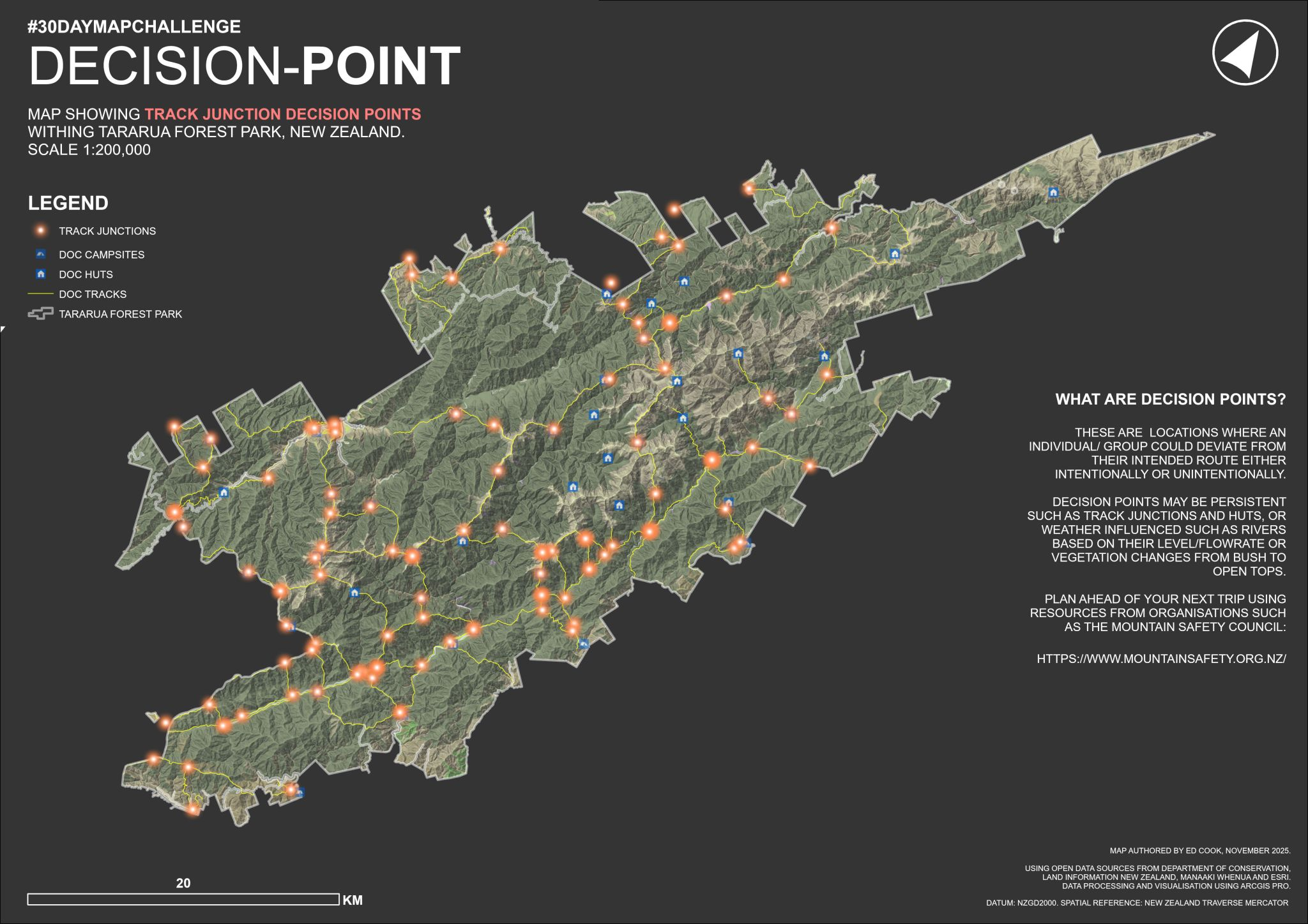
Why it stands out: It has heart, purpose, and immediate real-world application. This is cartography that matters.
2. Frans Geurts – Monumental Trees of the Netherlands
A stunning piece of data art. Frans transformed a dataset of over 9,000 trees into a spike map where the height of each point visually represents a tree's stature. It’s a masterclass in creative data visualisation, turning a simple point map into a tactile, almost physical landscape.

Why it stands out: A highly creative and elegant way to represent a simple dataset, blending art and geography seamlessly.
1. Wanmei Liang – Miniature Night Lights Globe
My top pick goes to Wanmei for taking the theme to a whole new level—literally. Crafting a physical miniature globe using NASA's Black Marble data is an astonishing feat of craftsmanship. This entry goes beyond the screen, merging digital cartography with hands-on art in a way that is utterly unique and mesmerising.
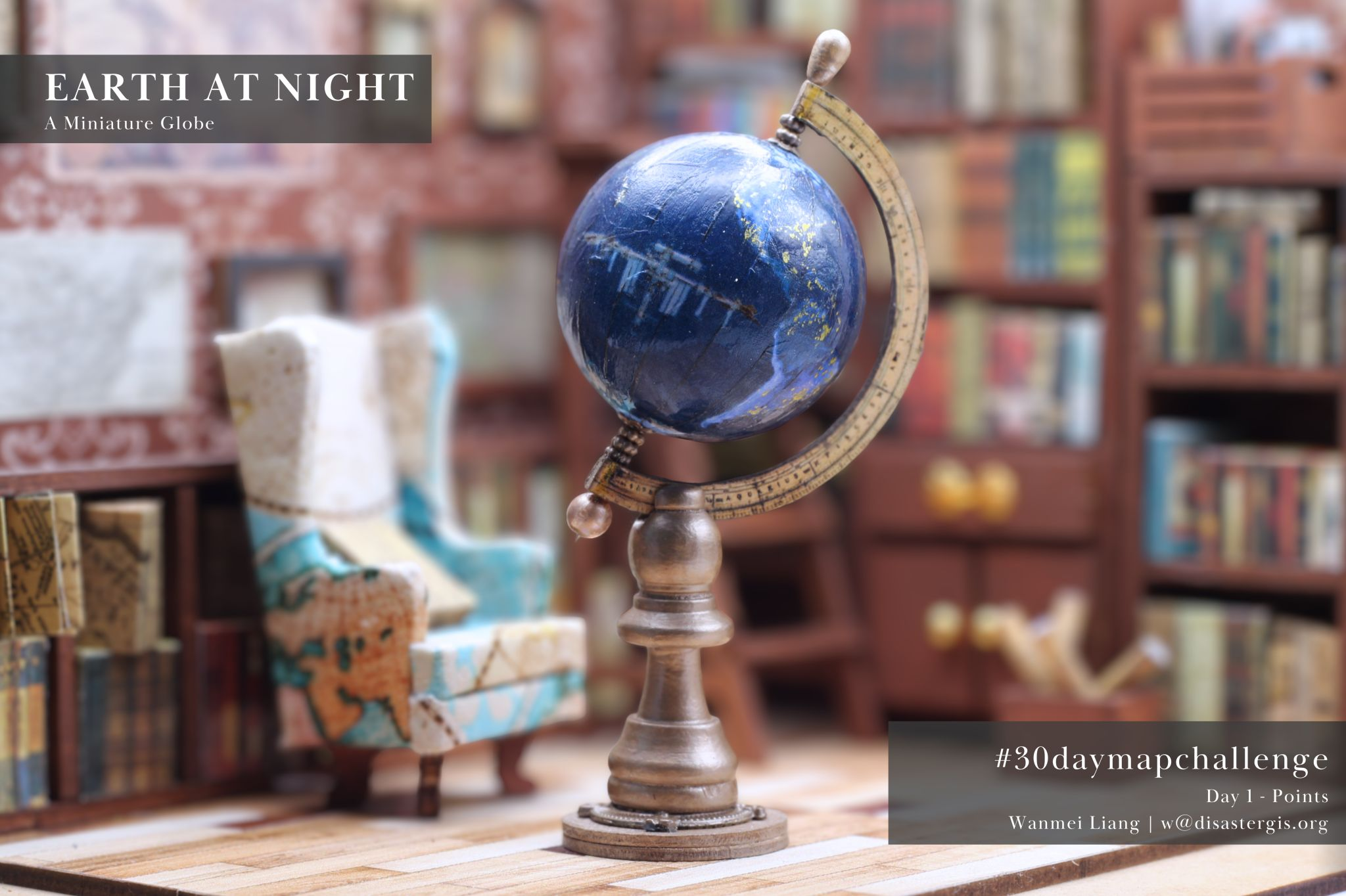
Why it stands out: Unmatched creativity and technical skill. It’s a tangible piece of art that you can hold in your hand, born from geospatial data.
The talent in this community is truly inspiring. Of course, with so many incredible entries, I’m sure there are amazing maps I haven’t seen yet. But from the ones I came across, these five stood out for their creativity, technique, and storytelling.
What was your favourite map from Day 1?


Comments ()