
Compiling data from the 1854 cholera outbreak in Soho
Introduction
As a GIS engineer at UniLaSalle, my main mission is to teach GIS fundamentals to future technicians and engineers in the fields of agriculture, agro-industry, and food and health. Many of these students did not come to the institute because of their love for computers, algorithms and information systems. I need to motivate them. I need to convince them GIS is relevant to their field.
A couple years ago, I was tasked with developing a geo-information elective course for students starting their food & health cursus. I wanted an old example of maps being used for the benefits of health. I am not an expert in health, but I have studied GIS. Therefore, one example came to my mind: the Soho cholera outbreak of 1854. If you studied GIS, you were probably told of John Snow identifying the contaminated water pump responsible for the outbreak through spatial analysis.
The 1854 Soho cholera outbreak
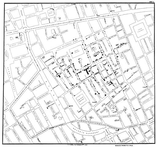
The reality is a little more complex, as detailed in this fascinating The Lancet article. In short, Snow already suspected water to be the vector of the disease, and identified the pump through interviews. The first map and spatial analysis were conducted by the Metropolitan Commission of Sewers, as the new sewers were accused of releasing miasma, or “bad air”. Under the direction of engineer Edmund Cooper, the spatial relationship between the victims and the sewage vents was studied. This resulted in a first map of the outbreak, establishing the absence of a link between the sewers and the deaths.
John Snow produced two maps, including the one representing the area closest to the pump on foot. This is the analysis I wanted to reproduce with my students. Unfortunately, this was a bit too advanced for their first GIS practical ever.
Snow managed to have the Broad Street pump removed. However, he did not overturn the miasma paradigm. Later, an official map was released. It located the origin of the epidemy on Broad Street as well. But rather than a walking distance, it displayed a circular buffer, in line with the miasma theory.
Data
I went in search for data to use in my practical. I found a dataset on Dr Robin Wilson’s blog. It contained deaths, pumps and basemaps: the georeferenced first Snow map and a couple OpenStreetMap extractions.
My initial plan was to reproduce Snow’s proximity analysis with modern GIS algorithms. This lead me to digitize missing pumps from Wilson’s dataset. After seeking advice from the GIS Stack Exchange community about a potential vector approach, I opted for a more traditional cost path analysis. This is how I came to create a cost raster from the scanned Snow map.
To compare my results to Snow’s, I set out to find a scan of his second map and digitize his outline of the area closest to the Broad Street pump.
During my searches, I also found the official map with its circular buffer. I also had to digitize that, of course.
Eventually, I decided to keep the practical simple. I ditched the fancy spatial analysis. And kept one basemap, the pumps, the deaths, and the proximity area outline.
However, there was one thing bugging me: the attribute tables were very empty. I created a field for street names for the pumps, so my students could identify the Broad Street pump and give it a different symbol.
But that wasn’t enough. I decided to do the same for the death dataset. Turns out the streets of Soho have changed since 1854. And Snow’s handwriting was... a physician’s handwriting. I found two useful information sources: the Wikipedia list of streets of London, and John Rocque's 1746 maps of London. In the process, I also found some victims that had not been digitized.
I ended up with a rather thorough collection of data regarding this famous case study. More thorough than I needed for my own application. Hopefully it can serve more people out there.
The folder contains:
- GIS data:
- The georeferenced John Snow map,
- A digitized version of the map with a cost attribute (1 for open environment, 999 for buildings),
- The georeferenced second John Snow map,
- The digitized outline of Snow’s proximity analysis,
- The water pumps of Soho,
- The cholera deaths recorded by John Snow,
- The georeferenced second map from the Metropolitan Commission of Sewers.
- Scanned maps: the first and second maps from the Metropolitan Commission of Sewers.
Until next time!


Comments ()